Singapore REIT Bubble Charts December 2021
These Bubble Charts are used to show the “relative” positions compared to other Singapore REITs and give additional hidden information to help in my research and analysis.
- Distribution Yield vs Price/NAV ** (Value Pick)
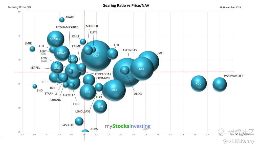
- Gearing Ratio vs Price/NAV (Risk Avoidance)
- Gearing Ratio vs Interest Coverage Ratio (Risk Avoidance)
** Distribution Yield are lagging.
Distribution Yield vs Price/NAV
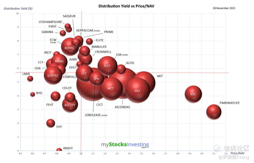
Distribution Yield is based on TTM (trailing twelve months) basis. Therefore it is a lagging indicator.
Gearing Ratio vs Price/NAV
Gearing Ratio vs Interest Coverage Ratio
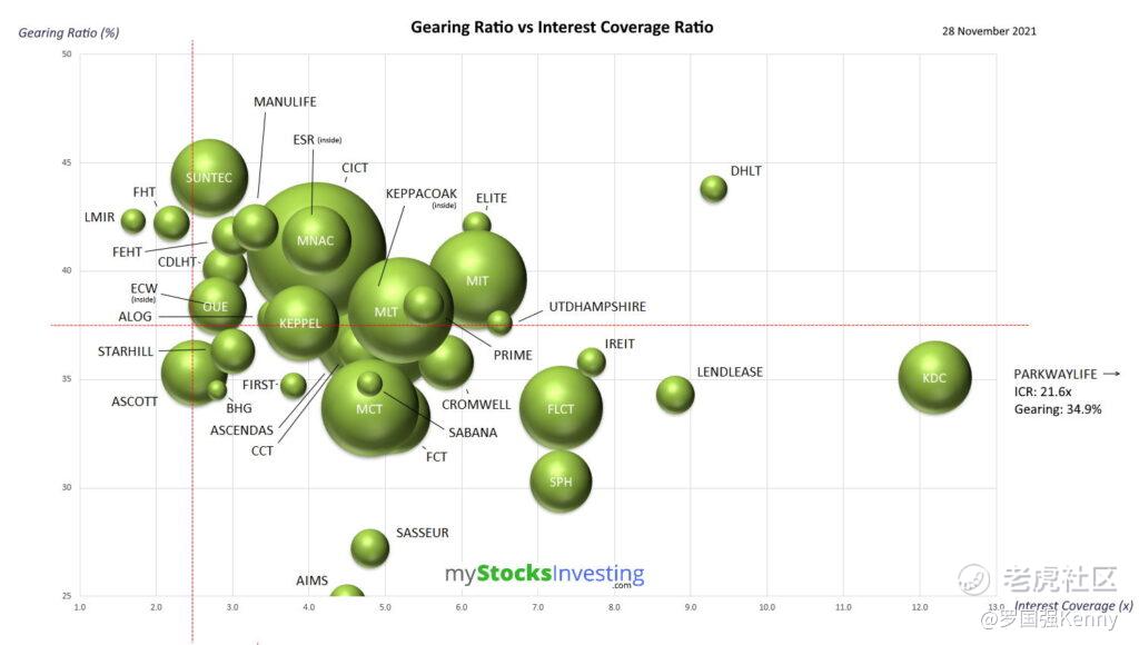
A slight correlation between Gearing Ratio and ICR can be observed. The lower the Gearing Ratio, the higher the ICR.
Compare to previous Singapore REIT Bubble Chartshere!
Disclaimer: The analysis is for Author’s own use and NOT to be used as Buy / Sell recommendation. Graphs plotted are best-effort basis.
Kenny Loh is a Senior Financial Advisory Manager and REITs Specialist of Singapore’s top Independent Financial Advisor. He helps clients construct diversified portfolios consisting of different asset classes from REITs, Equities, Bonds, ETFs, Unit Trusts, Private Equity, Alternative Investments, Digital Assets and Fixed Maturity Funds to achieve an optimal risk adjusted return. Kenny is also a CERTIFIED FINANCIAL PLANNER, SGX Academy REIT Trainer, Certified IBF Trainer of Associate REIT Investment Advisor (ARIA) and also invited speaker of REITs Symposium and Invest Fair.
免责声明:上述内容仅代表发帖人个人观点,不构成本平台的任何投资建议。